Art Square is a study of the creation of the corporate identity and the promotional campaign for a multi-purpose art space that includes a theatre stage, music stage, art exhibition space and a café bar. It took place in the context of a diplomatic project.
Our goal was to create a strong, sharp brand identity that will stand out and express all the cultural events that the space will host from time to time.
The split square
and the sharp contrast of
black and red become
a dynamic composition.
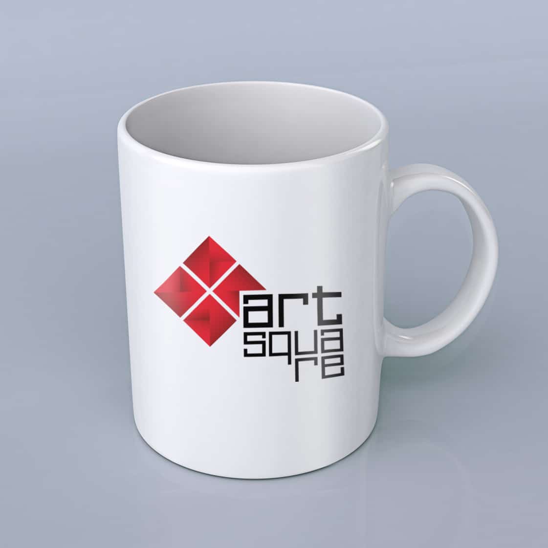
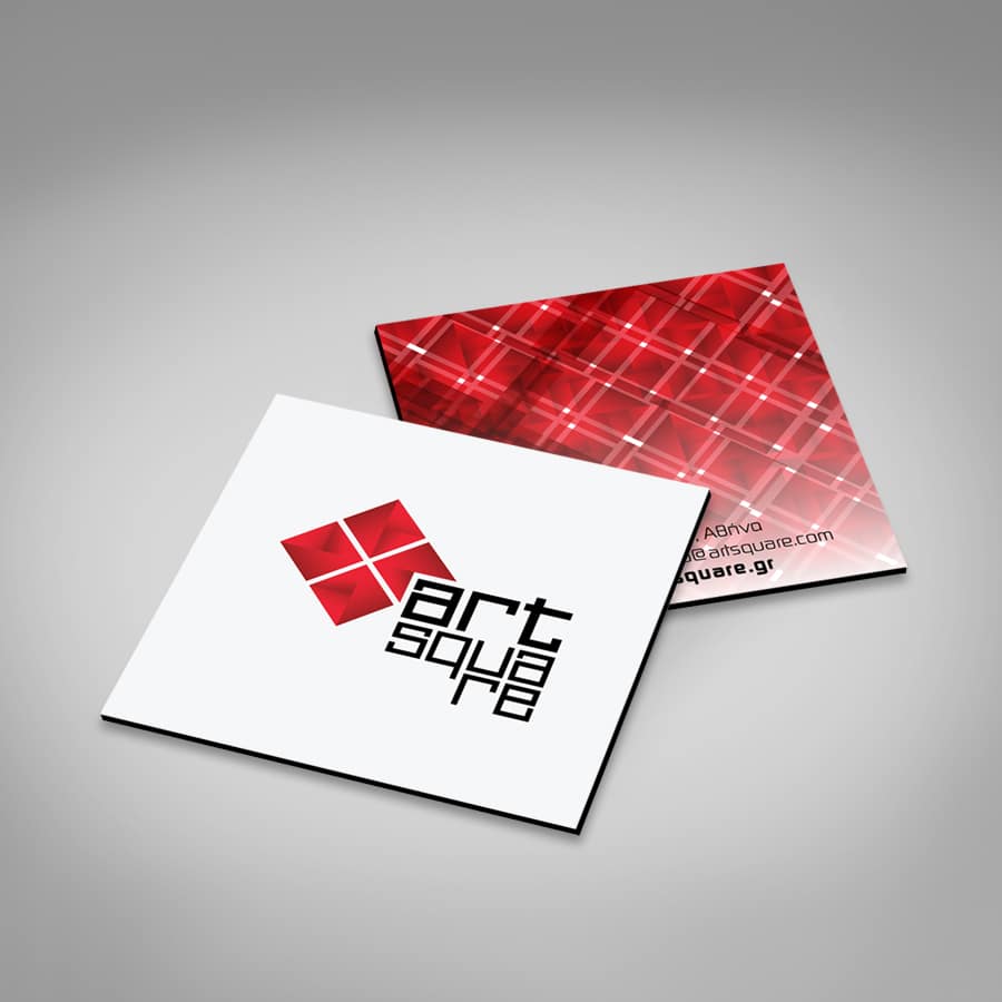
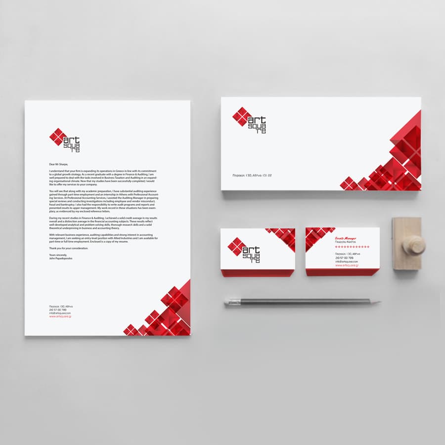
The design of the logo is based on the shape of a square, which is divided into four smaller ones, as many as the spaces offered by Art Square. The letters in the same arrangement as the sign create another square.
Strong colour contrast that stands out.
The colour palette is in shades of red and black. Red was chosen as the colour that expresses intensity, passion, dynamism, while black comes to balance all this intensity and create the contrast we are looking for.
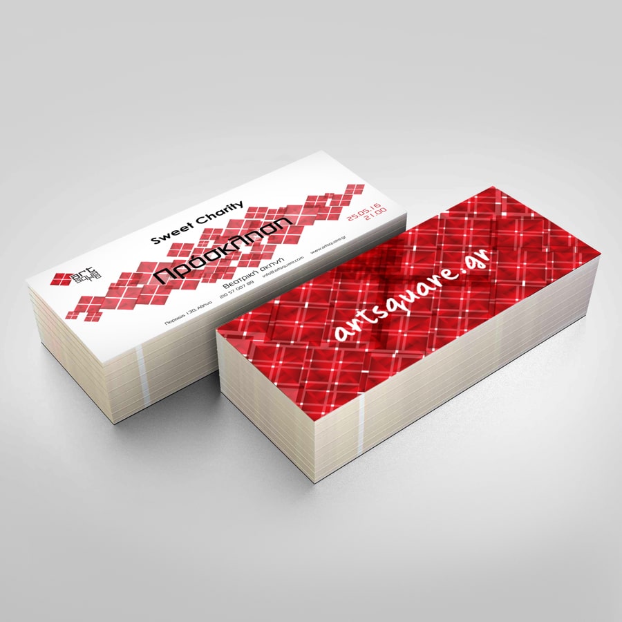
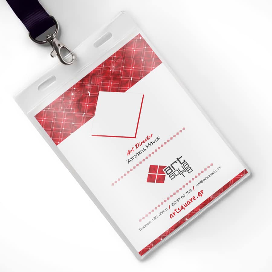
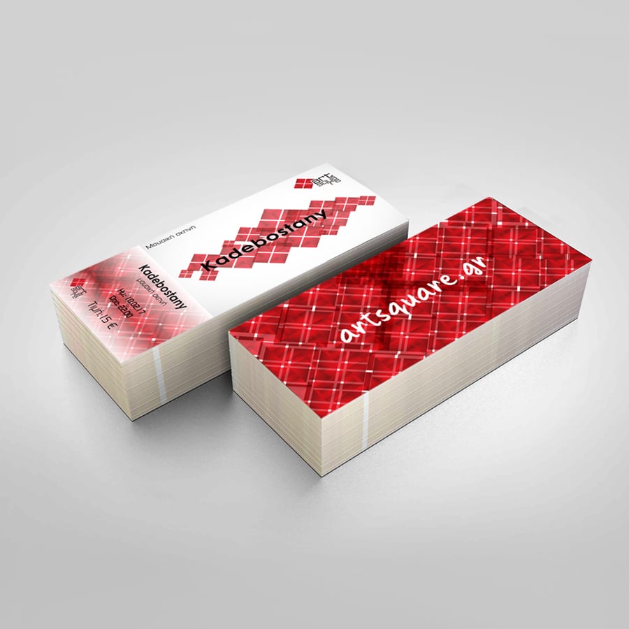
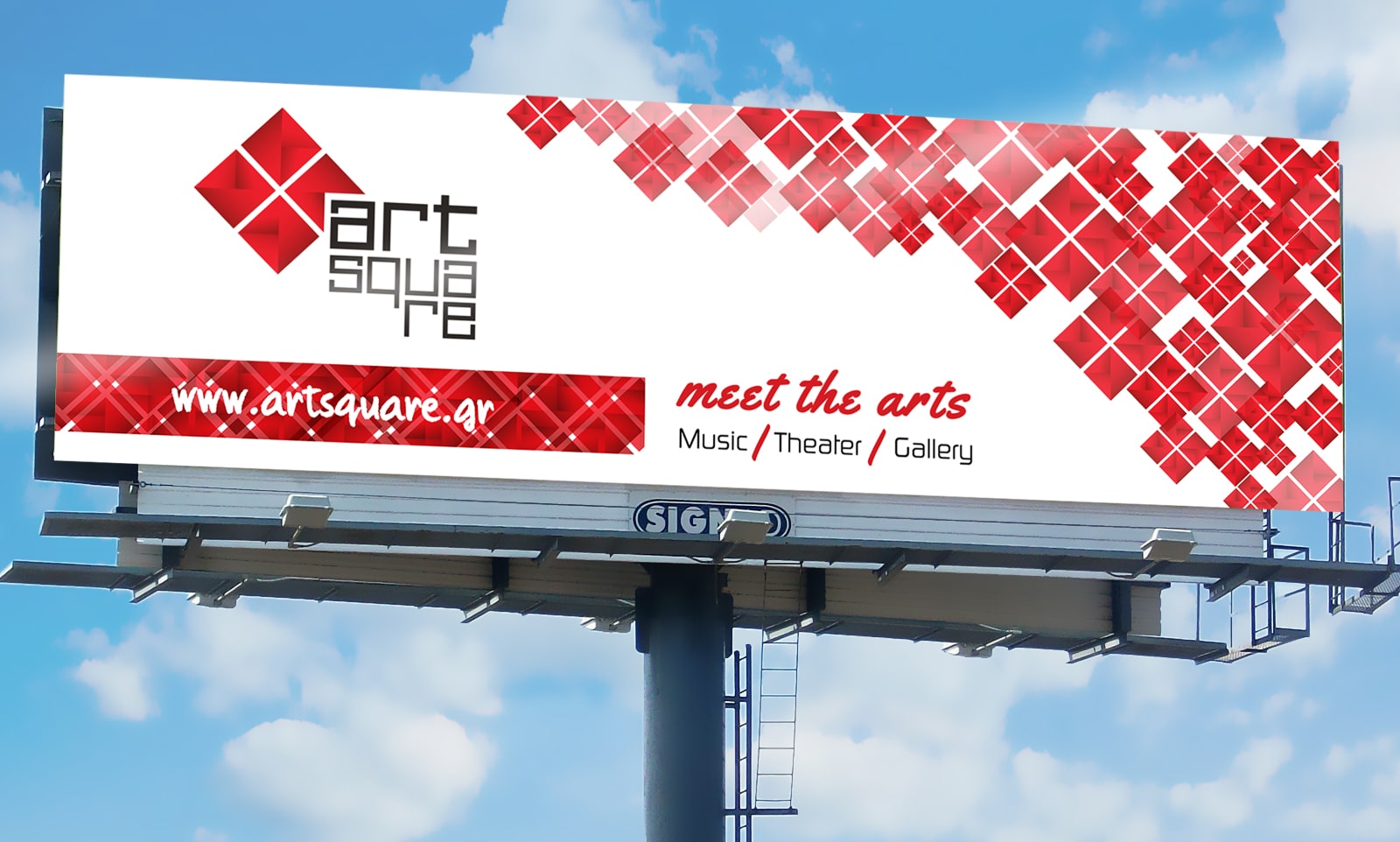
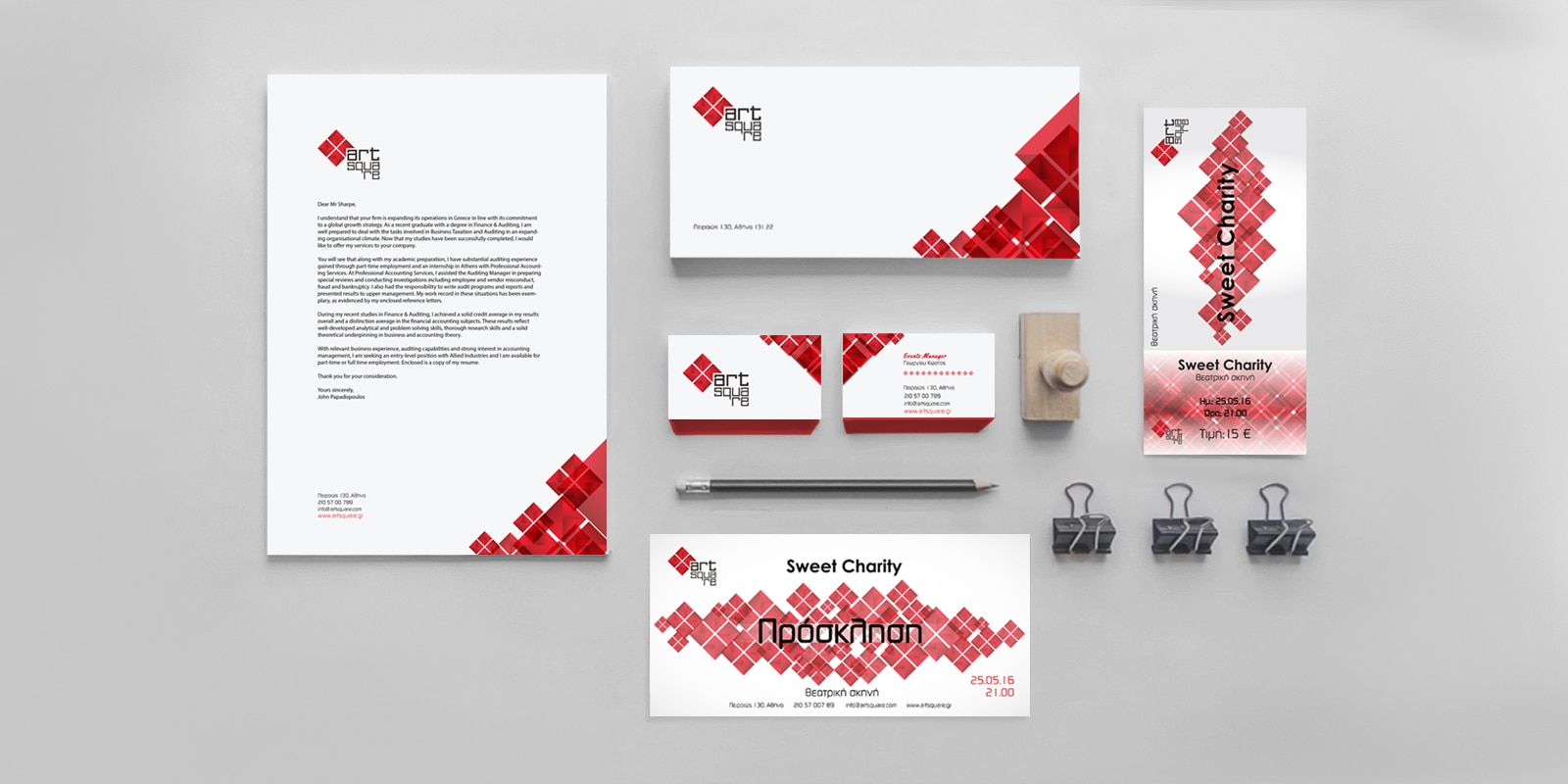
Promotional Material.
We created printed material to communicate the various events that would take place. Posters, brochures, flyers.
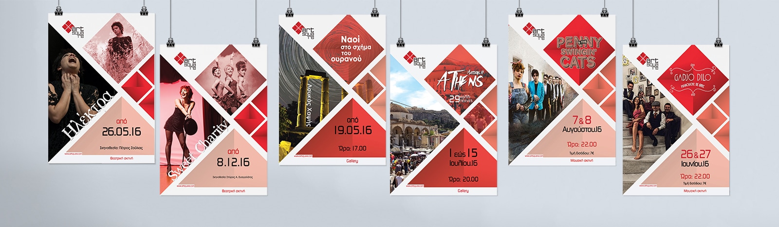
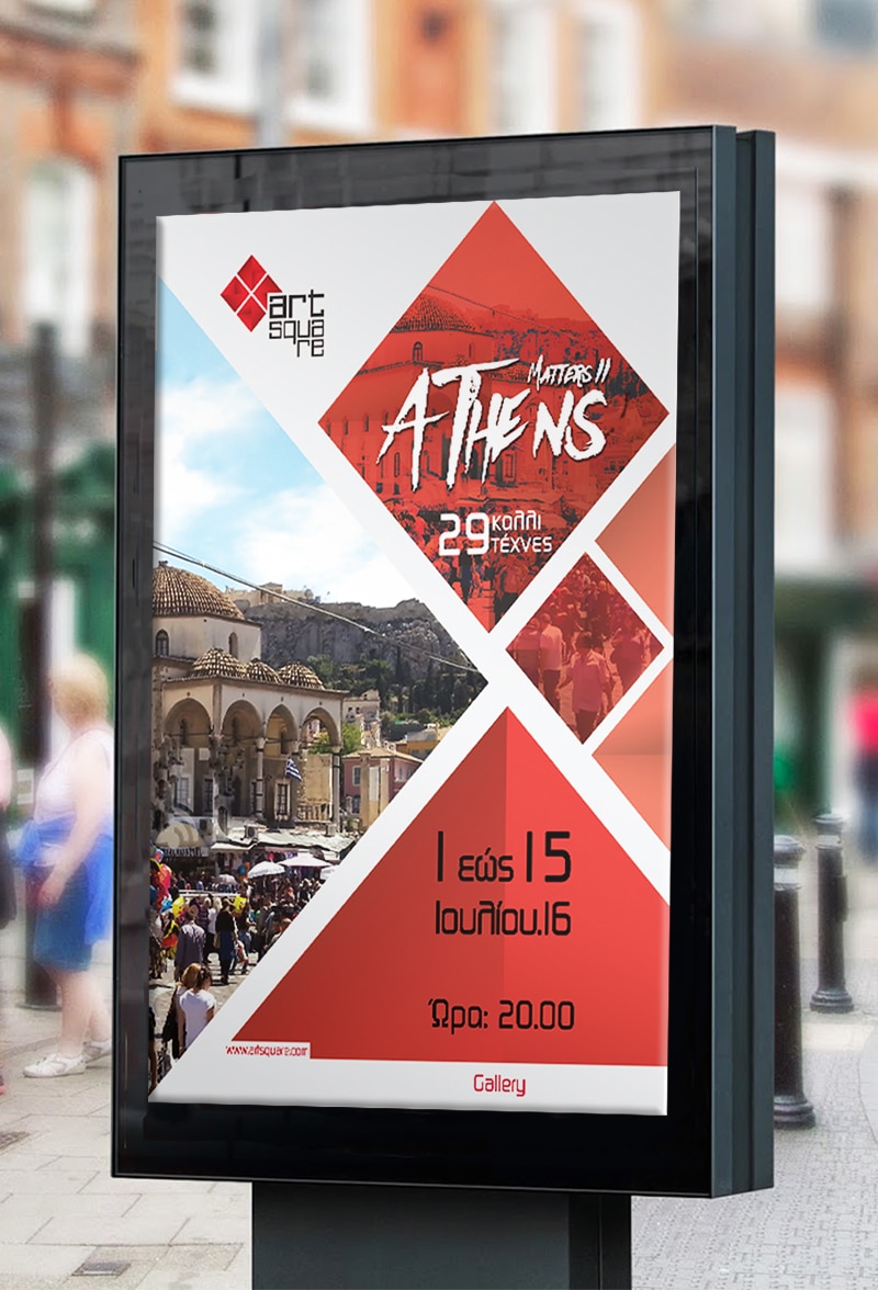
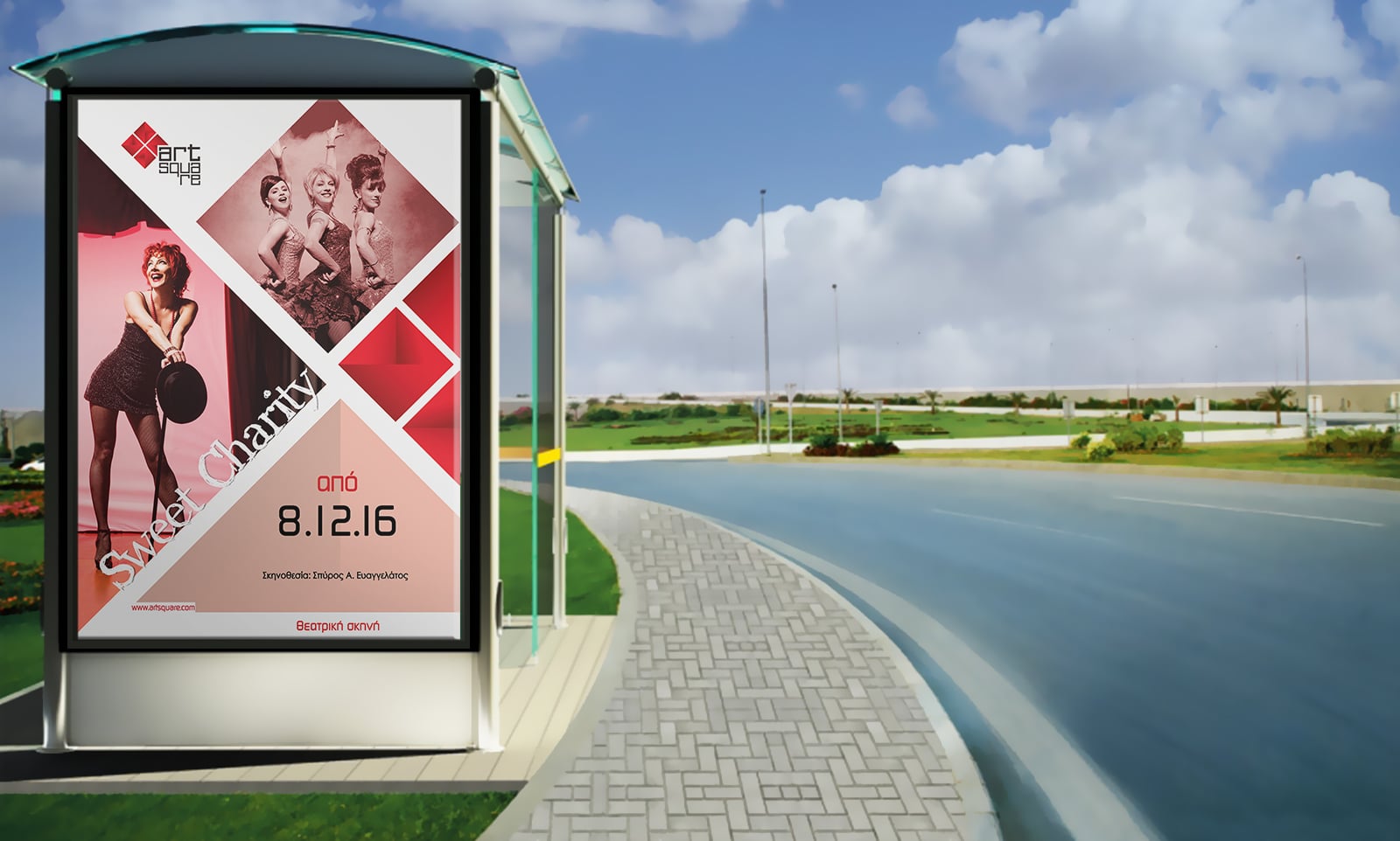
Posters for the
different events.
By creating a common canvas for all events we tried to strengthen the identity of the space. With fixed spaces for photos and information, we tried to create a recognisable pattern.
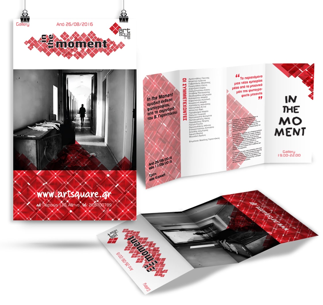
Quadruple Brochure.
Four-page brochure for an exhibition event at the gallery. The brochure when is unfolded creates a poster that visitors can keep as a souvenir of the exhibition.
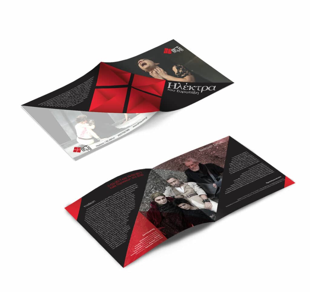
Brochure.
Square brochure for a theatrical performance, containing the plot and the cast of the play. The design is based on the square of the logo, which is broken down into different sizes to create an interesting effect.
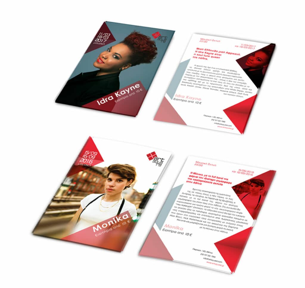
Flyers.
Promotional flyer, to inform about the concerts that will take place in the music scene. Again, the square plays a key role in the composition, so as to create an identity that stands out at first glance.
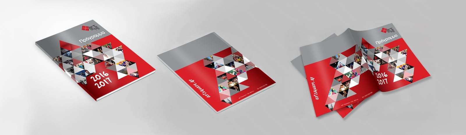
Annual Events
Program.
The programme of events is an 88-page book containing all the events of the year divided into three categories according to the hall in which they take place. For each event there is a summary, the dates and the contributors.
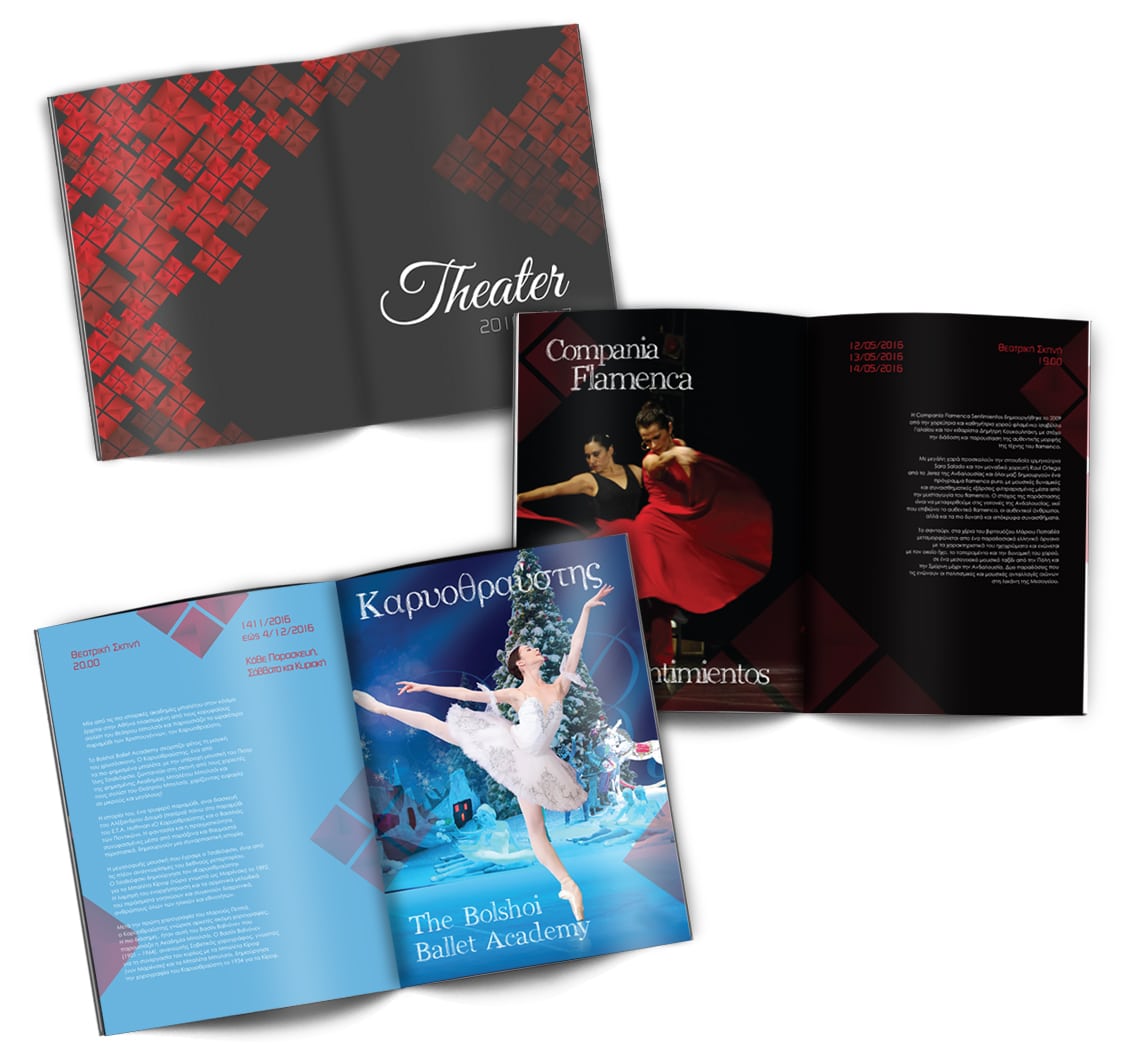
Inner pages from the annual programme. The two pages that open the theatre performances as well as some of the performance pages.
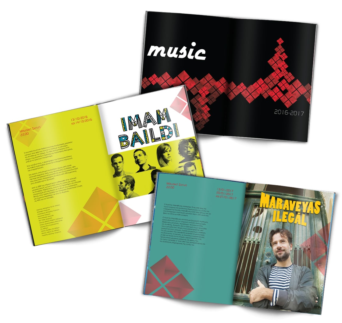
The inner pages that open the music events and some pages for the concerts. The design remains the same, on one page there is a photo of each event while the information for it, is put on the other.
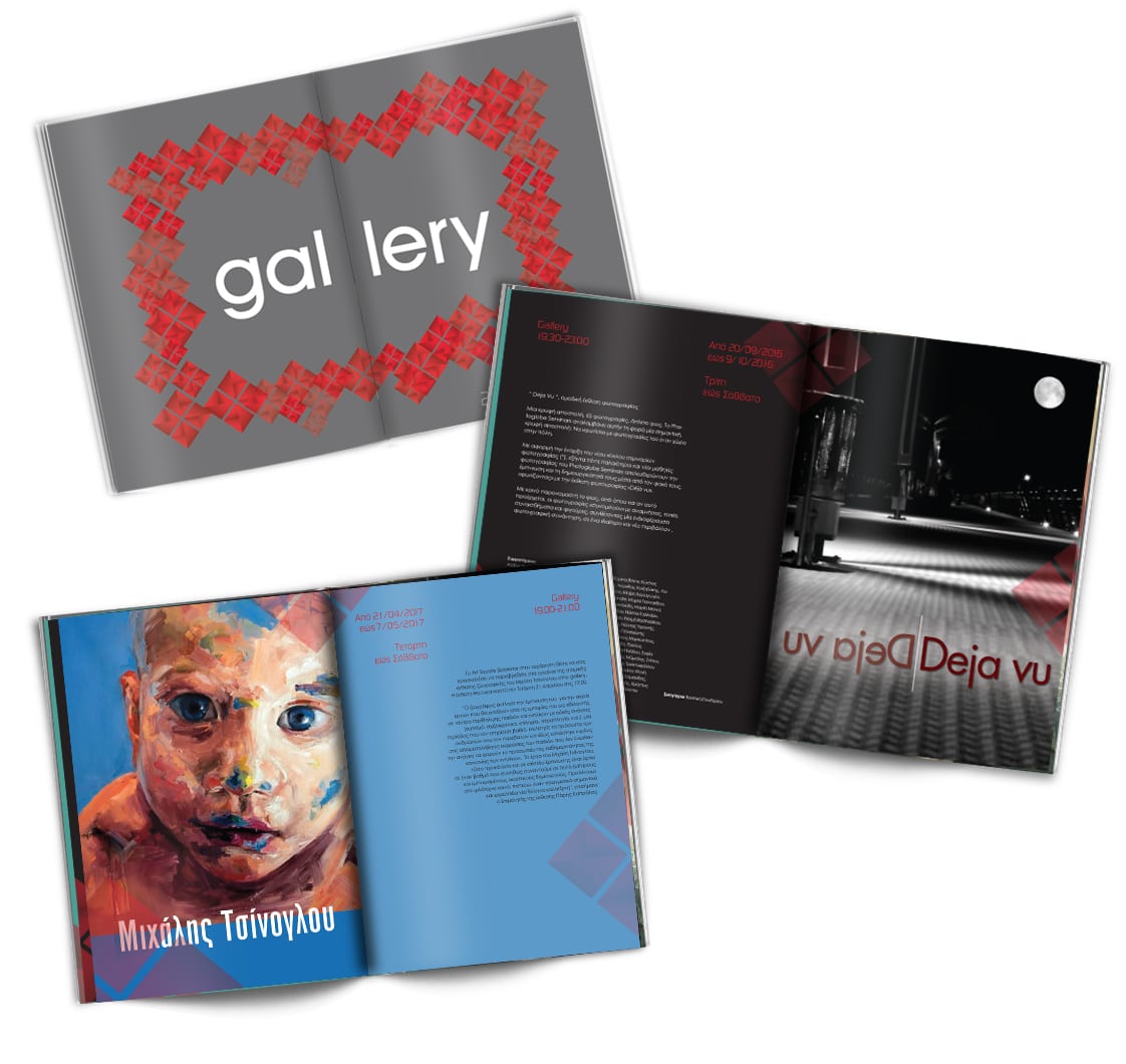
Inner pages from the part with the exhibitions. The color palette is maintained as the text colors are either white or black and the dates and locations range in two shades of red depending on the background.
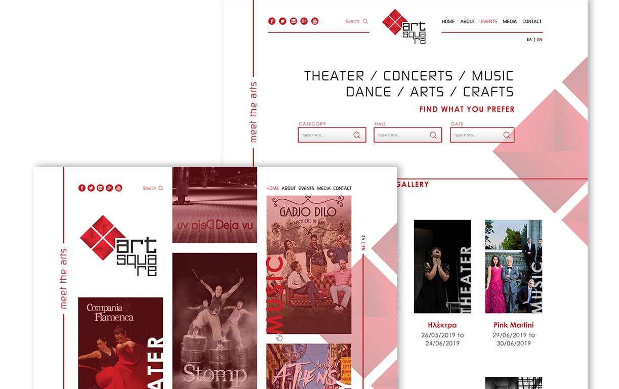
Website design.
The design of the website was based on making it easy for the user to navigate and find what they are looking for in a few clicks.
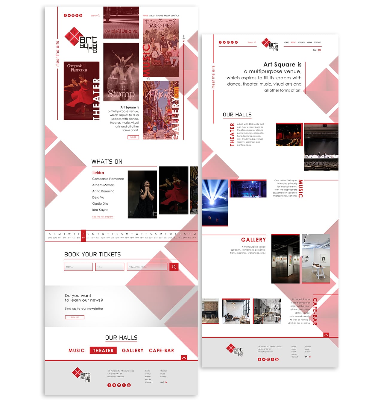
The home page with the shows taking place in the upper part. Further down the user can find the current events.
There is even a calendar so you can select the date you want to see the events that are on that date. As well as a function to book your ticket directly.
The page about the venue, with the spaces included and photos of them.


Here we see the page with the archive of the performances. Again there is a search with various criteria. As well as additional categorization according to the space in which they take place.
The contact page with details (address, phone numbers, etc.), a contact form and a map at the bottom, above the footer.
The navigation menu is divided in half by the logo. On the left are the links for social media and next to it is a search field and on the right are the pages. On the bottom right side is the language toggle.
Advertising applications.
Various advertising applications for the promotion of Art Square.